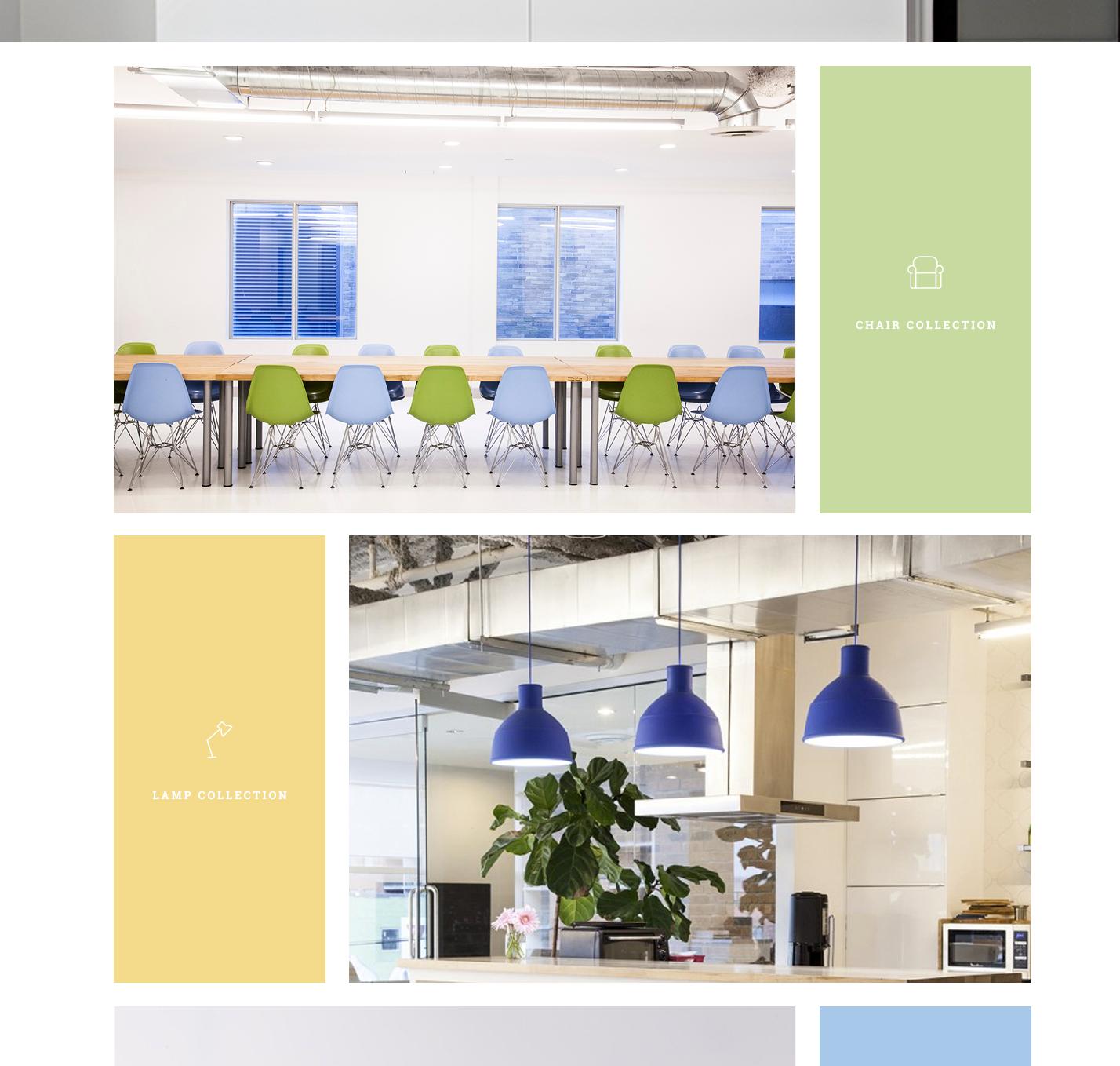
This is the layout I am trying to acheive:
Here is my current HTML + CSS (I'm just learning so sorry if it's repetitive and off :))
<div class="collection clearfix">
    <div class="image-left1"> </div>
    <div class="icon-left1">
        <img src="images/mainLP-chair-icon.png" alt="Chair Collection">
        <p>Chair Collection</p>
    </div>
</div>

<div class="collection clearfix">
    <div class="icon-right1">
        <img src="images/mainLP-lamp-icon.png" height="48" width="34" alt="Lamp Collection">
        <p>Lamp Collection</p>
    </div>
    <div class="image-right1"> </div>
</div>
... it alternates for a total of 5 divs stacked.
and CSS is
    /* =================== Main Section =================== */

    .collection {
        padding-top: 25px;
    }

    /*=================== CHAIRS ===================*/

    .image-left1 {
        background: url(../images/mainLP-chairs.jpg) center;
        height: 570px;
        width: 70%;
        display: inline-block;
    }

    .icon-left1 {
        float: right;
        width: 30%;
        background-color: #c7db9c;
        padding: 10px;
        border-left: 25px solid white;
        height: 570px;
    }


    .icon-left1 p {
        text-transform: uppercase;
        font-family: 'Roboto Slab', serif;
        color: #fff;
        font-weight: 400;
        font-size: 14px;
        position: relative;
        top: 220px;
        left: 36px;

    }

    .icon-left1 img {
        border: 0;
        position: relative;
        top: 222px;
        left: 76px;
    }

    /*=================== LAMPS ===================*/

    .image-right1 {
        background: url(../images/mainLP-lamps.jpg) center;
        height: 570px;
        width: 70%;
        display: inline-block;
    }


    .icon-right1 {
        float: left;
        width: 30%;
        background-color: #f4dc86;
        padding: 10px;
        border-right: 25px solid white;
        height: 570px;
    }


    .icon-right1 p {
        text-transform: uppercase;
        font-family: 'Roboto Slab', serif;
        color: #fff;
        font-weight: 400;
        font-size: 14px;
        position: relative;
        top: 220px;
        left: 36px;

    }

    .icon-right1 img {
        border: 0;
        position: relative;
        top: 222px;
        left: 93px;
    }


    .wrapper {
        width: 70%;
        margin: 0 auto;
    }  (This is around everything)
I'm not concerned yet about responsive but I should be down the road. A few issues I'm seeing.
The background image for each of the containers isn't sizing properly - it's getting cut off. How would I fix that?
There must be a better way to float the icon and text in the div beside the image../ right now it's wonky and positioned relative which I don't think is correct. OR if it is correct I think I have coded it wrong.
Aucun commentaire:
Enregistrer un commentaire